The 3 color rule in interior design involves using three main colors in a room’s color scheme to create visual harmony and balance. This rule typically consists of one dominant color, one secondary color, and one accent color, which are used in varying proportions throughout the space.
When it comes to interior design, color plays a crucial role in setting the mood and atmosphere of a room. The 3 color rule provides a simple yet effective guideline for creating a cohesive and aesthetically pleasing design. By carefully selecting and combining three complementary colors, designers can achieve a harmonious and balanced look that enhances the overall appeal of the space.
We’ll explore the principles behind the 3 color rule and how it can be applied to create stunning interior design schemes.
The 3-Color Rule
In interior design, the 3-color rule is a foundational principle that guides the selection and coordination of colors within a space. This rule simplifies the process of choosing a color scheme and ensures visual harmony. When executed effectively, it can transform a room, creating a cohesive and aesthetically pleasing environment.
Definition and Origin
The 3 Color Rule, also known as the Rule of Three Colors, is a concept that originated in the world of art and design. It suggests that an effective color scheme for any space should be comprised of three distinct colors.
Application in Interior Design
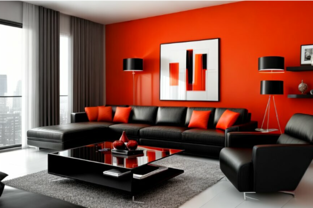
When applied to interior design, the 3 Color Rule serves as a practical guide for selecting a well-balanced color palette. It emphasizes the use of three key colors in varying proportions: a dominant color, a secondary color, and an accent color.
Impact On Mood and Atmosphere
The 3 Color Rule in Interior Design has a significant impact on the mood and atmosphere of a space.
Creating Balance
When colors are chosen wisely, they can create a sense of harmony and balance in a room.
- Combining three colors effectively helps in maintaining visual equilibrium.
- Each color plays a specific role in balancing the overall aesthetic.
Enhancing Visual Interest
By incorporating three colors, interior design gains depth and visual appeal.
- Different hues add layers and dimension to the space.
- Textures and patterns can be highlighted through the chosen color scheme.
Using The 60-30-10 Rule
When it comes to designing a space, color plays a vital role in creating the right atmosphere and aesthetic appeal. The 3 Color Rule in interior design is a guideline that helps designers choose the right combination of colors to achieve balance and harmony in a room. One popular approach to implementing this rule is by using the 60-30-10 rule.
Primary Colors
The primary colors in interior design are the dominant colors that set the overall tone and mood of the room. These colors typically make up 60% of the color scheme. It could be the color of the walls, furniture, or large decorative items. Primary colors create a foundation and provide a sense of stability.
Secondary Colors
Secondary colors make up 30% of the color scheme in the 60-30-10 rule. These colors complement the primary colors and add depth and visual interest to the space. They can be used in upholstery, curtains, or accent pieces such as rugs or throw pillows. Secondary colors help in creating a cohesive and balanced look.
Accent Colors
Accent colors are the remaining 10% in the 60-30-10 rule. These colors are used sparingly but have a significant impact on the overall design. Accent colors add a pop of color and draw attention to specific areas or objects in the room. They can be incorporated through artwork, accessories, or small decorative elements.
Implementing the 60-30-10 rule ensures that the mix of primary, secondary, and accent colors creates a cohesive and visually appealing color scheme. By balancing the proportions of these colors, designers can create a harmonious environment that reflects the desired style and atmosphere.
Common Mistakes to Avoid
Are you familiar with the 3 3-color rule in interior design? It’s a guideline that helps create visually appealing spaces by using three colors in a room: a dominant color, a secondary color, and an accent color. Many interior design enthusiasts often overlook this rule, leading to overwhelming or uncoordinated color schemes.
By understanding and implementing the 3 3-color rule, you can avoid common mistakes and achieve a harmonious and balanced look in your home.
When it comes to interior design, implementing the 3 color rule can significantly enhance the overall look and feel of a space. However, even the most well-intentioned designers can make mistakes that compromise the effectiveness of this rule. To ensure your color scheme is on point, it’s important to be aware of these common mistakes and avoid them at all costs. Let’s take a closer look at what these mistakes are and how to steer clear of them.
Overcomplicating Color Scheme
One of the most prevalent mistakes in interior design is overcomplicating the color scheme. While it may be tempting to add multiple vibrant hues to a space to make it more visually appealing, it often results in a cluttered and chaotic look. Remember, less is more when it comes to color selection.
Instead of overwhelming the room with an array of different shades, opt for a maximum of three colors and incorporate them strategically. Choose a dominant color, a secondary color, and an accent color. The dominant color should cover about 60% of the room, the secondary color should take up around 30%, and the remaining 10% can be reserved for the accent color.
This 3 color rule helps create a harmonious and balanced look, allowing each color to shine without overpowering the others. By limiting the number of colors used, you create a cohesive and visually pleasing space that doesn’t overwhelm the senses.
Ignoring The Role of Neutrals
Another common mistake is ignoring the role of neutral colors in the color scheme. Neutrals act as the foundation of any design and play a crucial role in tying the entire space together. They provide a sense of tranquility and balance, while also allowing the chosen colors to stand out.
When selecting neutrals, consider shades of white, beige, gray, or taupe. These timeless hues provide a versatile backdrop and can be easily paired with any color scheme. Incorporating neutral tones through furniture, walls, or accessories can create a neutral base for the selected colors to pop.
Remember, incorporating neutrals doesn’t mean sacrificing personality or vibrancy in your design. They serve as a canvas that allows your chosen colors to shine and create a cohesive and aesthetically pleasing space.
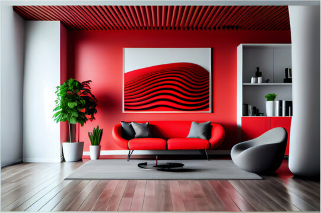
Complementary Color Schemes
A complementary color scheme is based on colors that are opposite each other on the color wheel. These pairs of colors create a high contrast, vibrant look that adds energy and excitement to a room. One popular color scheme that designers often turn to is the complementary color scheme.
Understanding Pairings
A complementary color scheme in interior design involves pairing colors opposite each other on the color wheel. This results in a dramatic and vibrant look that creates a sense of balance in the space.
Implementing in Design
When incorporating a complementary color scheme, choose one dominant color and use the opposite color as an accent.
- Ensure the dominant color is used for larger areas like walls or furniture.
- Use the accent color for decorative items and smaller details to create contrast.
Embracing Color Psychology
Embracing color psychology in interior design can significantly impact the mood and atmosphere of a space. Understanding the 3 Color Rule and its relation to color psychology is crucial for creating harmonious and visually appealing interiors that evoke the desired emotions.
Choosing Colors Wisely
When selecting colors for interior spaces, it’s essential to consider the psychological effects they can have on individuals. Warm tones such as red and orange can evoke feelings of energy and warmth, while cool tones like blue and green tend to create a sense of calm and serenity. By carefully choosing a primary color along with two complementary colors, the 3 Color Rule can be applied to create a balanced color scheme that reflects the intended mood of the space.
Eliciting Intended Emotions
Each color has the power to elicit specific emotions. Red, for example, is often associated with passion and excitement, while yellow can bring about feelings of happiness and positivity. Understanding how different colors influence emotions can help in creating environments that cater to specific moods and purposes, whether it’s to encourage relaxation in a bedroom or stimulate creativity in a workspace.
Adapting The Rule to Different Spaces
Understanding the concept of the 3 Color Rule in interior design is essential for creating visually pleasing and harmonious spaces. While the rule itself remains constant, it can be adapted and applied differently in various settings to achieve the desired atmosphere and functionality. Whether you are designing a residential interior or a commercial space, let’s explore how the 3 3-color rule can be tailored to meet the unique requirements of each environment.
Residential Interiors
In residential interiors, the 3-color rule serves as a versatile tool to create a warm and inviting ambiance that reflects the personal style and preferences of the occupants. When applying this rule, consider the following:
- Choose a dominant color that sets the overall mood of the space. This color should be used in larger areas, such as the walls or furniture, to establish a cohesive and harmonious backdrop.
- Introduce a secondary color that complements the dominant color and adds depth to the design. This can be incorporated through smaller elements like throw pillows, artwork, or accent pieces.
- Lastly, select an accent color that adds a pop of interest and draws attention to specific features or areas within the room. This can be achieved through accessories, such as vases, cushions, or rugs.
Commercial Settings
In commercial settings, the 3-color rule plays a crucial role in establishing a professional and cohesive visual identity that aligns with the brand or purpose of the space. Here’s how it can be adapted:
- Identify the brand’s color scheme and incorporate it into the design, ensuring that the dominant color reflects the company’s identity and branding.
- Select a secondary color that complements the dominant color while adding depth and visual interest. This color can be used in features like accent walls, furnishings, or signage.
- Consider the use of neutral colors as a base to create a timeless and versatile backdrop for the brand’s colors. Neutrals can be applied to walls, flooring, or large furniture pieces.
Personalizing With Accents and Textures
In interior design, the 3-color rule is a popular concept that involves selecting three colors to create a cohesive and visually appealing space. However, adding accents and textures is an essential aspect of personalizing your interior design and elevating it to the next level. Accents and textures allow you to add depth and character to your space, making it unique and reflective of your taste and style.
Adding Depth and Character
When it comes to personalizing your interior design, adding depth and character is crucial. Accents and textures provide an opportunity to create visual interest and showcase your personality. By incorporating various elements like throw pillows, rugs, curtains, or artwork, you can enhance the overall aesthetic appeal of your space.
One approach for adding depth and character is to mix and match different textures. By combining smooth and rough textures, you can create a visually stimulating environment. For example, pairing a soft velvet couch with a rustic wooden coffee table can bring a sense of balance and contrast to your living room. Additionally, experimenting with different fabric materials can add a touch of luxury or a cozy atmosphere, depending on your preference.
Another way to add depth and character is to include accent pieces. These are decorative items that can catch the eye and serve as focal points within a room. Whether it’s a vibrant artwork on the wall, an eye-catching vase on the dining table, or a unique sculpture displayed on a shelf, accent pieces can instantly draw attention and make a statement. They allow you to express your individuality and bring a sense of personality to your space.
Balancing With Color Scheme
When personalizing with accents and textures, it’s important to ensure that everything harmonizes with the overall color scheme of your interior design. Consistency is key to maintaining visual coherence. The accent colors and textures should complement the three-color palette you have chosen.
To achieve a balanced look, consider using accent pieces or textures in hues that either match or complement the three primary colors in your color scheme. For instance, if your chosen color scheme includes shades of blue, you can incorporate accent pieces in similar tones such as teal or navy. Alternatively, you can opt for complementary colors like orange or yellow to add a pop of contrast.
| Primary Color | Accent Color | Texture |
| Gray | Yellow | Faux fur accent pillows |
| Beige | Teal | Bamboo blinds |
| Navy Blue | Gold | Metallic accent mirrors |
Remember, personalizing your interior design with accents and textures allows you to infuse your unique style and create a space that resonates with your personality. By adding depth and character through a thoughtful selection of textures and accent pieces, you can transform your home into a reflection of who you are.
Conclusion
Understanding the 3-color rule is key to mastering interior design cohesion. By applying this concept wisely, you can create harmonious spaces that evoke the desired emotions. Keep experimenting with colors to elevate your design skills and make your living space truly unique and inviting.
Master the rule and unleash creativity!

