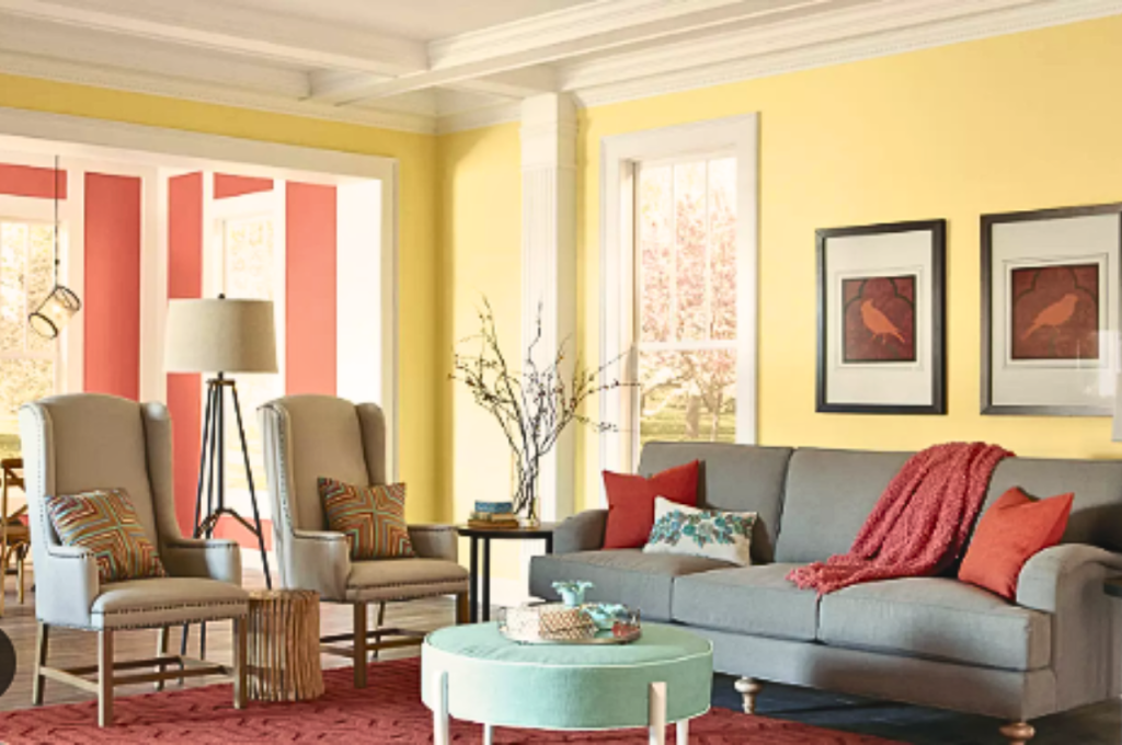
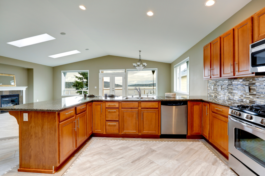
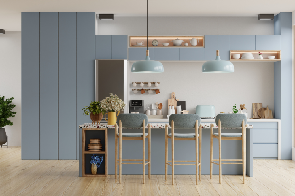
To choose an interior design color, consider the room’s purpose, lighting, and the mood you want to create. Think about your personal preferences, color psychology, and the existing furniture and decor.
Additionally, take into account the current trends and timeless options that will stand the test of time. Select a color scheme that complements the overall aesthetic of your home and reflects your style and personality. By carefully considering these factors, you can choose the perfect interior design color that enhances the space and creates a cohesive and visually appealing environment.
Remember, the right color can transform a room and elevate its design to the next level.
The Importance of Interior Design Color
Choosing the right color for your interior design is crucial as it can create a specific mood, impact perception, and ultimately define the overall aesthetic of a space. The significance of interior design color lies in its ability to evoke emotions, influence the perception of the room, and set the tone for the entire living or working environment.

Creating A Mood
Colors have the power to evoke different emotions and create a specific mood in a room. For instance, warm tones like red, orange, and yellow can elicit feelings of warmth, energy, and coziness, while cool tones such as blue and green can create a sense of calmness and relaxation. The careful selection of colors can enhance the desired atmosphere within a space, whether it be a lively social area or a serene bedroom retreat.
Impacting Perception
The choice of interior design color can significantly impact perception as colors can visually alter the size and shape of a room. Lighter shades can make a space feel more open and airy, while darker hues can add a sense of intimacy and coziness. Moreover, colors can also affect the perception of temperature and light, influencing how spacious and inviting a room appears to occupants and visitors.
Understanding Color Psychology
Explore the impact of colors on interior design decisions. Discover how color psychology shapes choices and influences emotions, allowing you to select the right colors for your space. Understanding the psychological effects of colors can help you create the desired ambiance and achieve a harmonious interior design.
Warm Colors
Warm colors evoke feelings of energy and excitement, such as red, orange, and yellow. Their stimulating nature makes them ideal for social areas like living rooms and dining rooms.
Cool Colors
Cool colors like blue, green, and purple evoke calm and relaxation. Use them in bedrooms or home offices to create a tranquil atmosphere.
Neutral Colors
Neutral colors like white, gray, and beige provide a versatile backdrop in any room. They work well with both warm and cool colors, creating a balanced look.
Factors to Consider
When choosing an interior design color, there are several factors to consider to create a harmonious and aesthetically pleasing space. By carefully evaluating the room function, natural lighting, and existing furniture, you can find the perfect color palette that complements the overall design scheme. Let’s delve into each of these factors.
Room Function
The first factor to consider when choosing an interior design color is the room function. Different rooms serve different purposes, and the color you choose should align with the function of the space. Here are some examples:
- Kitchen: Consider using vibrant and energetic colors like red or yellow to create a lively atmosphere that boosts productivity in meal preparation.
- Bedroom: Opt for calming colors like blue or lavender to promote relaxation and a peaceful sleep environment.
- Living Room: Choose warm and inviting colors like beige or earth tones to create a cozy and welcoming space for socializing and relaxation.
Natural Lighting
The second factor to consider is the natural lighting in the room. Natural light can significantly affect the way colors appear, so it’s essential to take this into account when selecting a color scheme. Here are some guidelines:
- If the room receives ample natural light, you can opt for darker or bolder colors as they will be balanced by the brightness of the sunlight.
- In rooms with limited natural light, lighter and neutral colors are recommended to create an illusion of space and brightness.
- Consider how the placement of windows affects the room’s lighting throughout the day. Test your chosen color samples under different lighting conditions to ensure they maintain their intended look.
Existing Furniture
The final factor to consider is the existing furniture in the room. The color of your furniture can influence the color palette you choose. Here’s what to keep in mind:
| Existing Furniture Color | Recommended Color Palette |
| Brown or Beige | Neutral colors like taupe or cream |
| White or Gray | Subtle pops of color like pastels or muted tones |
| Bold or Vibrant | Consider a complementary color scheme or choose neutral colors to balance the vibrancy |
By considering the room function, natural lighting, and existing furniture, you can make an informed decision when choosing an interior design color that seamlessly blends with your space. Taking these factors into account will help you create an inviting and visually appealing environment.
Color Selection Techniques
Discover effective color selection techniques for interior design that suit your style and space. Explore coordinating shades, contrasting accents, and mood-enhancing palettes to create a personalized and visually appealing environment. Experiment with sample swatches to find the perfect colors that resonate with your design vision.
Choosing the right colors for your interior design can be a daunting task. However, with the help of color selection techniques, you can create a harmonious and visually appealing space.
Color Wheel
The color wheel is a valuable tool to understand how different colors interact with each other. It consists of twelve colors arranged in a circular format, with primary, secondary, and tertiary colors represented. By using the color wheel, you can easily identify color schemes that work well together.
Here’s an overview of the color wheel and its primary color categories:
| Primary Colors | Secondary Colors | Tertiary Colors |
| Red | Orange | Red-Orange |
| Blue | Green | Yellow-Green |
| Yellow | Purple | Blue-Purple |
Understanding the relationships between colors on the wheel will help you choose complementary or analogous colors for your interior design.
Creating Color Flow
Creating color flow is essential for a cohesive and balanced interior design. Color flow refers to the way colors transition from one space to another or from one element to another within the same space. It ensures a smooth and visually pleasing experience as you move throughout the room.

To create color flow, consider the following techniques:
- Choose a dominant color that will be the primary color in most of the space.
- Use accent colors to add visual interest and variation, but be careful not to overwhelm the space.
- Gradually transition colors by using shades, tints, or tones of the dominant color.
By following these techniques, you can achieve a seamless color flow that enhances the overall aesthetic of your interior design.
60-30-10 Rule
The 60-30-10 rule is a popular guideline used in interior design to achieve a well-balanced and visually pleasing color scheme. It suggests allocating percentages of three different colors to create depth and dimension:
- 60% should be the dominant color that covers the majority of the space.
- 30% should be a secondary color that complements the dominant color.
- 10% should be an accent color that adds a pop of excitement and visual interest.
Following this rule, you can create a cohesive well-designed space that captures attention without overwhelming the senses.
Harmonizing Color Schemes
Choosing an interior design color can be overwhelming, but harmonizing color schemes can create a cohesive and visually appealing space. Consider the mood, lighting, and the existing elements in the room to select the perfect color palette that reflects your style and personality. Choosing interior design colors can be overwhelming. You can create a cohesive and visually appealing space.
Monochromatic
Monochromatic color schemes use shades of a single color. This creates a calm and unified look in a room.
Analogous
Analogous color schemes involve colors that are next to each other on the color wheel. This creates a cozy and welcoming atmosphere.
Complementary
Complementary color schemes consist of colors that are opposite each other on the color wheel. This brings drama and contrast to a space.
Avoiding Common Mistakes
When it comes to choosing an interior design color, there are some common mistakes that people often need to pay more attention to. These mistakes can result in a color choice that doesn’t quite meet your expectations or clashes with the overall aesthetic of your space. To ensure that you make the best color decisions for your home, it’s important to avoid these common pitfalls. Let’s take a closer look at three common mistakes to avoid when choosing an interior design color.
Ignoring Undertones
One mistake that many people make when selecting an interior design color is ignoring undertones. Undertones are the subtle hints of color that are present within a shade. While they may seem insignificant, undertones can greatly affect how a color looks in your space. For example, a gray with a cool blue undertone will appear different than a gray with a warm yellow undertone. To ensure that you choose a color with the right undertones, it’s essential to sample different shades in person.
Skipping Samples
Samples are a crucial step in the color selection process, yet many people skip this important task. Without seeing the color in person, you may end up with a hue that looks completely different from what you expected. Lighting conditions, surrounding colors, and even the room’s orientation can all impact how a color appears. By taking the time to order or purchase samples and test them out in the space, you can make an informed decision and avoid any unpleasant surprises.
Overlooking Finish
Another common mistake is overlooking the finish of the paint or material. The finish refers to the surface texture and sheen of the color. Whether you choose a matte, satin, or glossy finish can have a significant impact on the overall look and feel of a room. A matte finish tends to be more subtle and conceals imperfections, while a glossy finish is more reflective and can brighten up a space. Consider the desired effect you want to achieve and choose a finish that enhances the overall aesthetic of your interior design.
Incorporating Accent Colors
When selecting interior design colors, incorporating accent colors can bring a vibrant and personalized touch to your space. By carefully choosing complementary hues, you can create an aesthetically pleasing and cohesive look that reflects your style and personality.
Strategic Placement
When incorporating accent colors into your interior design, strategic placement is key. The right placement of accent colors can make a significant impact on the overall aesthetic of a space. By strategically placing accent colors, you can create focal points, add depth, and enhance the visual appeal of any room.
Here are a few tips for strategically placing accent colors:
- Consider the purpose of the room:
- Is it a living room where you want to create a cozy and welcoming atmosphere?
- Is it a home office where you want to promote focus and productivity?
- Is it a bedroom where you want to create a calming and relaxing environment?
- Identify the areas you want to highlight:
- Do you have a beautiful fireplace that you want to draw attention to?
- Are there architectural features like columns or archways that you want to accentuate?
- Are there specific pieces of furniture or artwork that you want to make a statement?
- Choose accent colors that complement the existing color palette:
- Take into consideration the colors of your walls, flooring, and large furniture pieces.
- Look for colors that harmonize with the dominant colors in the room.
- Consider using a color wheel to find complementary or analogous colors.
- Balance the intensity of accent colors:
- Playing with the intensity of your accent colors can create different effects.
- For a more subtle look, choose muted or pastel shades.
- If you want to make a bold statement, opt for vibrant and saturated colors.
- Remember to consider the size of the space and the desired mood when selecting the intensity of your accent colors.
Balancing Intensity
When incorporating accent colors into your interior design, it’s essential to find the right balance of intensity. Balancing the intensity of your accent colors ensures they enhance rather than overwhelm the overall design scheme.
Here are some tips for balancing the intensity of accent colors:
- Use neutral tones as a base:
- Neutrals such as white, gray, or beige serve as a backdrop and help anchor the overall color scheme.
- They provide a calming effect and allow the accent colors to stand out.
- Consider the 60-30-10 rule:
- Allocate 60% of the color scheme to a dominant color, which typically includes walls and larger furniture pieces.
- Allocate 30% to a secondary color that complements the dominant color.
- Use the remaining 10% for accent colors to add pops of visual interest.
- Create visual harmony:
- Avoid using too many bold or vibrant accent colors as they can create a chaotic or overwhelming visual effect.
- If you have multiple accent colors, consider using them in different areas of the room rather than nearby.
- Alternatively, you can use different shades of the same color to create a cohesive and harmonious look.
Testing and Finalizing
When it comes to interior design, testing and finalizing the color choices is crucial to achieving the desired look for your space. Here are some essential steps to help you in this process:
Sampling Colors
Take the time to sample colors by painting small sections of your walls or using swatches. This will help you see how the color looks in your space under different lighting conditions.
Considering the Time of Day
Consider the time of day when the natural light in your room is at its brightest and dimmest. Colors can look different depending on the lighting, so make sure to evaluate them at different times.

Conclusion
Choosing the right interior design color is crucial in creating a harmonious living space. Consider the room’s purpose, lighting, and desired mood. Remember to test samples and trust your instincts. By following these steps, you can truly transform your home with the perfect color palette.
Start exploring your options today!

